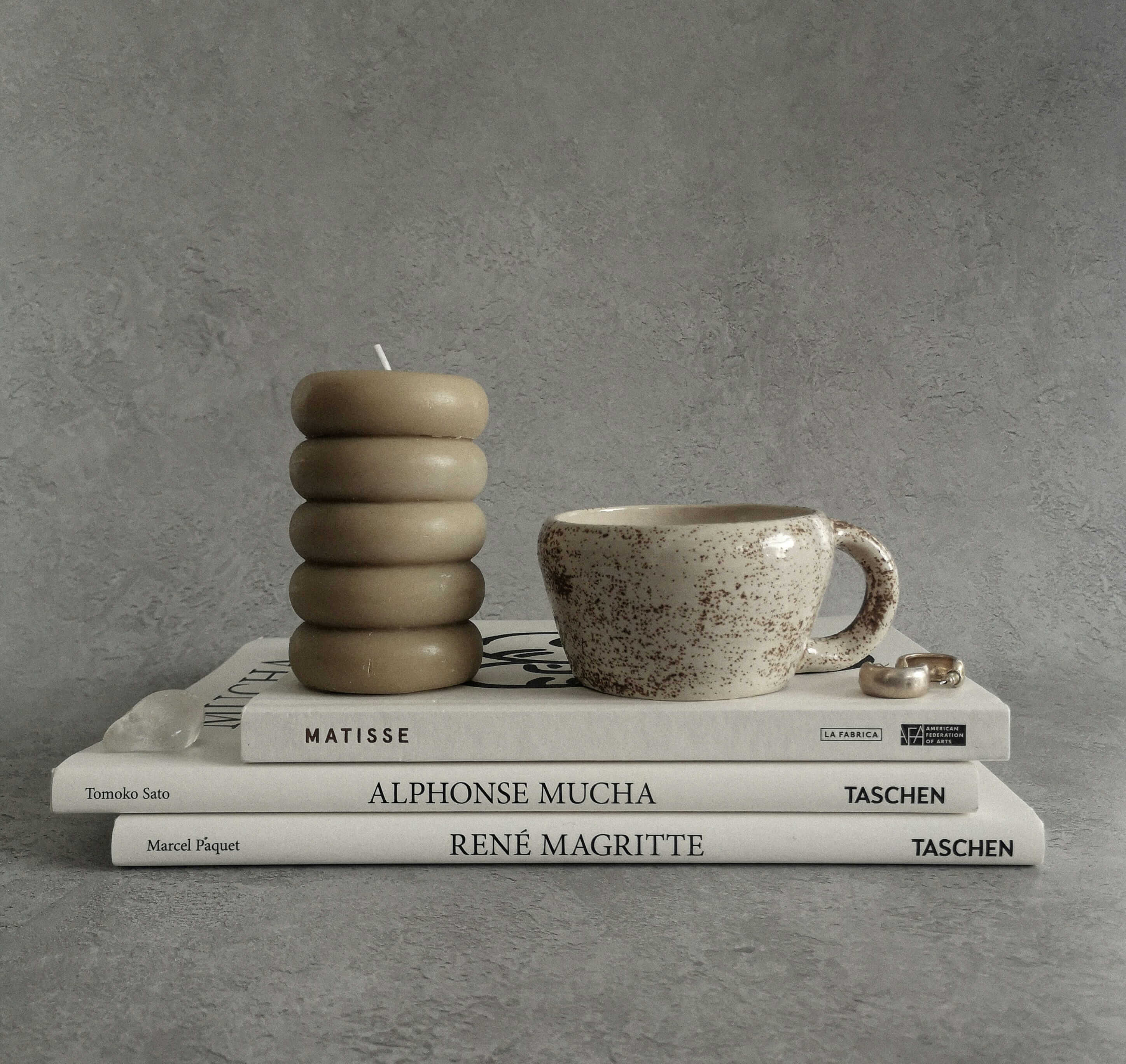
Arketype Editorial
Editorial Design
2025
Arketype Magazine
2 Weeks
James Okafor
Editor in Chief, Arketype Magazine
An editorial design system for an independent design publication finding its visual voice.
Arketype is an independent print and digital publication covering design, architecture, and visual culture. Launched two years ago with a strong editorial point of view but no coherent visual system, the magazine had been designing each issue from scratch — inconsistent, time-consuming, and increasingly at odds with the sophisticated audience they were building. The brief was to create a comprehensive editorial design system that could be handed off to their in-house team and used consistently across every issue.
Building a system flexible enough to be interesting.
Editorial design systems live and die by one tension — they need to be consistent enough to build a recognizable identity across issues, but flexible enough that each issue can feel distinct and surprising. Too rigid and the magazine becomes predictable. Too loose and it loses the coherence that makes a publication feel authoritative. The challenge was finding the constraints that enabled creativity rather than limiting it.
A typographic system with built-in variation.
The solution is a system built on one typeface family used at extreme ends of its range — display headlines at 88px with tight leading, body copy at 16px with generous leading. The grid allows for three distinct layout modes — full bleed, editorial split, and text-only — each defined precisely enough to be consistent but different enough to create variety. Color is restricted to black, white, and one rotating accent per issue. The system gives the in-house team the tools to produce a beautiful magazine without needing to make fundamental design decisions from scratch each time.
"We went from spending three weeks designing each issue to spending three days. The system didn't constrain us — it freed us to focus on the editorial decisions that actually matter."